How to Create a Responsive Website Using Bootstrap and Tailwind
In today’s digital world, having a responsive website is essential for offering an optimal browsing experience across different devices such as smartphones, tablets, and desktops. By making sure your website adjusts fluidly to any screen size, a responsive design enhances user experience and retention.
Tailwind CSS and Bootstrap are two of the most widely used frameworks for making responsive websites. In this article, we'll examine how to combine the two frameworks, each of which has certain advantages, to create a fully responsive website.
Our specialty at Pro SolutionX is web development, and we work with companies to build successful, responsive websites. Let's explore how to optimize Tailwind with Bootstrap for responsive web design.
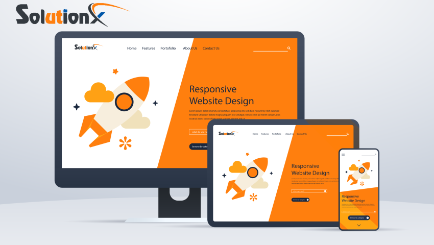
What is a Responsive Website?
A website that automatically resizes its text, pictures, and layout according to the screen size of the device it is being viewed on is called responsive. A combination of flexible graphics, fluid grids, and media queries that enable the website to adapt to the user's device are used for doing this.
Responsive websites are critical for:
- Improving user experience: Users expect websites to look great and function well on any device.
- Boosting SEO: Search engines like Google prioritize responsive websites for mobile-first indexing.
- Increasing conversion rates: A responsive design ensures that visitors can easily navigate your site, no matter their device.
Overview of Bootstrap
Bootstrap is one of the most widely-used front-end frameworks, providing a collection of pre-built components and a responsive grid system that simplifies the design process.
Key features of Bootstrap:
- Grid System: It uses a 12-column grid layout, allowing for flexible and responsive designs.
- Pre-built Components: Buttons, navigation bars, modals, and more.
- Custom Utilities: Offers customization options for your design needs.
Why use Bootstrap?
- It’s easy to use, making it great for both beginners and experienced developers.
- The framework has extensive documentation and community support.
- It comes with ready-to-use components that speed up development time.
Overview of Tailwind CSS
Tailwind CSS is a utility-first CSS framework that allows you to design your website by applying utility classes directly to your HTML elements. Because Tailwind doesn't include pre-built components as other frameworks do, you can develop unique designs without having to write new CSS.
Core features of Tailwind CSS:
- Utility-first: Tailwind provides utility classes for nearly every CSS property, allowing for highly customized designs.
- Customizable: You can tailor the framework to your needs through configuration files.
- Performance-focused: Tailwind is minimalistic in terms of file size, and you can purge unused CSS to make your site faster.
Why use Tailwind CSS?
- It’s highly customizable, giving you the flexibility to create unique designs.
- Its lightweight nature makes it ideal for performance-focused websites.
- The utility-first approach allows for faster development and easier debugging.
Step-by-Step Guide to Creating a Responsive Website
- Planning the Website
Before diving into code, define the website’s purpose, structure, and content. Sketch wireframes or use design tools like Figma to map out the layout. - Setting Up the Development Environment
- Installing Bootstrap: You can include Bootstrap via CDN or download it. Link the necessary CSS and JavaScript files to your project.
- Installing Tailwind CSS: Tailwind can be added via a CDN or npm. You’ll need to configure it in your project to use it effectively.
- Building the Layout with Bootstrap’s Grid System
Start working with Bootstrap's grid structure to create a responsive layout. Its 12-column style allows you to organize your page using rows, columns, and containers. Add more pre-made elements, such as buttons, forms, and navigation bars. Customizing with Tailwind CSS
Use Tailwind’s utility classes to style your elements. By applying classes likebg-blue-500, p-4, text-centeryou can quickly customize the design of your webpage. Tailwind allows you to define custom themes and breakpoints to fine-tune the responsiveness.
- Testing Responsiveness
To see how your website works on various screen sizes, use the browser developer tools. You can emulate mobile and tablet devices with tools like Chrome DevTools. Keep an eye out for layout problems and adjust your code as necessary.
FAQs
- Can I use Bootstrap and Tailwind together?
Yes, you can use both frameworks together. Bootstrap can handle the overall structure, while Tailwind can be used for detailed styling and custom design elements. - Which framework is better for beginners?
Bootstrap is often more beginner-friendly due to its pre-built components and simpler structure. Tailwind is more advanced but offers greater customization for experienced developers. - How do responsive websites improve SEO and user experience?
Search engines like Google like responsive websites because they guarantee a consistent user experience on all devices. Better user retention and higher rankings result from this. - What are the costs of developing a responsive website?
The cost varies depending on the complexity of the website and whether you use a framework like Bootstrap or Tailwind. Pro SolutionX can help you get an accurate estimate based on your needs. - Can Pro SolutionX assist in creating a responsive website?
Absolutely! Our team specializes in responsive web design using frameworks like Bootstrap and Tailwind. Contact us today for a consultation!
Why Choose Pro SolutionX for Your Responsive Website?
Pro SolutionX has extensive experience in developing responsive websites with the latest technologies, including Bootstrap, Tailwind, and custom solutions. Our team of experts will ensure your website not only looks great on any device but also performs efficiently to drive business growth.
Get in touch with us today to start building a responsive website that will elevate your online presence!
Conclusion
Creating a responsive website is no longer optional—it’s a necessity for businesses looking to succeed in the digital landscape. By using frameworks like Bootstrap and Tailwind, you can create a website that adapts to all devices, providing a smooth user experience and boosting SEO.
Pro SolutionX is here to help you build an outstanding responsive website. Contact us today to get started and explore how we can bring your vision to life!

Meer Alamin
Leave a comment
Your email address will not be published. Required fields are marked *